- 07 April 2018
- FrogLearn (1)
Though this article is related to the FrogLearn LMS, the concepts and strategies can be used effectively in web design in general.
Whitespace
By default, FrogLearn’s theme layout gives you around 12px of space between columns. This gives more space to cram your content into but it’s at the expense of whitespace. I’m a big fan of whitespace, it can make your content easier to read and follow whilst adding a more professional look and feel. A busy web page can be hard to digest and navigate.
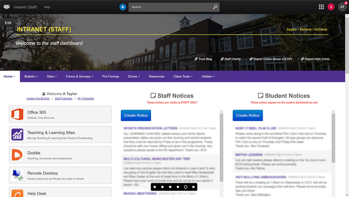
Here’s an example of some content displayed in a three column layout with the default column spacing:
It looks ok, but it’s a little hard to distinguish where one content area finishes and another starts. It’s all a bit tight. This makes it difficult to draw attention to key chunks of content like important site links. You can add blank spacing vertically with the blank space widget but not horizontally. Plus, it’d be far more practical to increase the spacing site-wide with one reusable snippet of code wouldn’t it? We’ll get to that bit soon.
Taking things to the extreme, here’s an example of a very busy web page on the Daily Mail website:
Pretty distracting right? It’s displaying a lot of content but the lack of spacing doesn’t help either. Just a little padding between columns can make a massive difference.
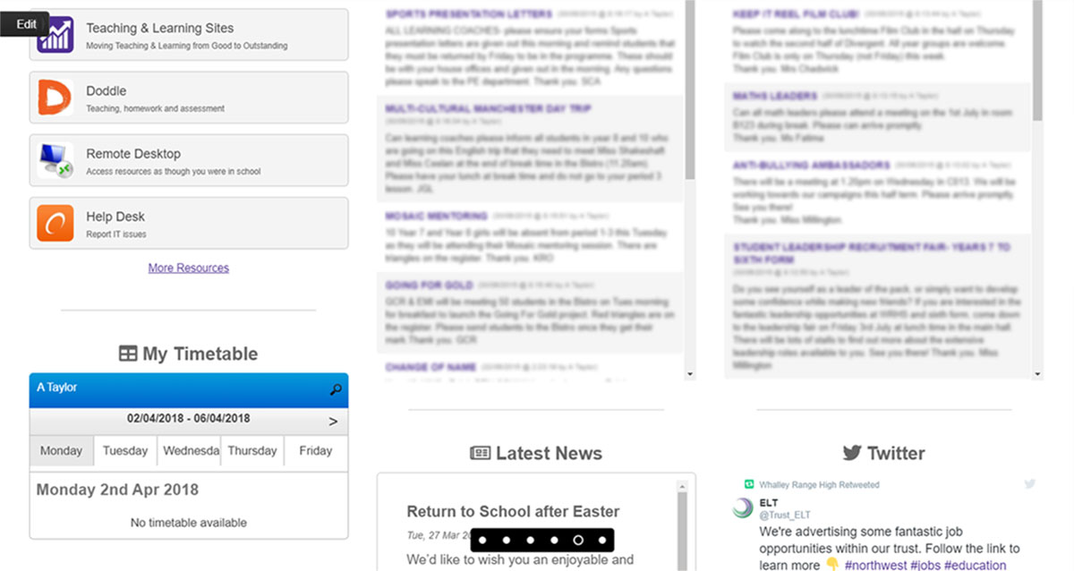
Take a look at the example below, this is the desired effect I’m looking for:
Better? I think so, it’s now really clear where one chunk of content ends and another begins. Your eyes are drawn to one block of content at a time and it’s much cleaner and professional looking too.
The Code
You can achieve the same results on your FrogLearn themes with just a little CSS. Drop a HTML widget onto the homepage of your theme and add the code below. This wont work out of the box, you’ll need to change the class named my_theme to match the main class that’s wrapped around your particular theme. You can look this up by inspecting the page with the developer tools in your browser.
<style>
	/* increase spacing between columns */
	@media (min-width:800px) {
		.my_theme .two,.my_theme .three,.my_theme .four{
			padding:0 1em;
		}
	}
</style>
Pretty straightforward really. I’ve not gone mad here, I’ve just added 1em of padding to the sides of each column. You can adjust this value to get the desired spacing for your theme. I’ve also put this inside a media query so it’ll only take effect on screens with 800px of width or higher, since the spacing looks perfectly fine when the columns are vertically stacked on mobile devices.
It’s worth noting that this technique works best on full width themes, or themes where the main content block has a width of 1000px or greater. Anything less than that is going to look pretty squashed either way if you’re using three columns or more, but it’s worth experimenting with.
Found this useful? Have any other tricks you’d like to share? Feel free to add these in the comments below.


Comments
Whether you have feedback, a question, want to share your opinion, or simply want to say thank you - we welcome comments! Please read the disclaimer.